

Ease a (very) long questionnaire with sensitive questions
COMPANY
Oliva Health
RESPONSIBLE FOR
UX, UI, Proto, User-testing, code with CSS-SVG
PROJECT DURATION
4 months
As a user, I will complete my wellbeing profile so that I can receive personalised content to help me where I need to.
As Oliva Health, I need to ask sensitive and official psychology questions so that we can professionally assess the person and provide the right care.
Scope
Design a long form with a minimum drop off
Reach a completion rate below 10 minutes
Build a non judgmental profile
Objectives
After designing a first version based on what the competition was doing, we ran around 12 user interviews and testing where we faced a high rate of rejections. There was a sentiment of being judged about their wellbeing, which was counter productive for them. We had to rethink our approach.
User interviews
We couldn’t show any kind of “rating” to measure the various aspect of their wellbeing but still encourage some areas where they could improve.
The questionnaire could be very long. We had to find a way to motivate them to continue with a lot of progressive steps.
The wellbeing shape was very difficult to build in front-end, I learned pure SVG drawing to help the frontend engineer.
As health professionals, we had to design a flow for high-risk profiles (suicide)
Challenges encountered
We released the questionnaire with a very low drop off (less than 10%) and a completion rate around 7-8 minutes so we were happy with that. The wellbeing shape was seen as non judgemental and nice to have. Overall the user satisfaction was good as they could see that they can get personalised content to help them thanks to this onboarding .
Results
Isolate the questionnaire to reduce drop-off
Show immediate progress
Insert motivating steps of progression
Mental health is very sensitive and every one is different
Don’t rely on what competition is doing
Take aways
Project screenshots
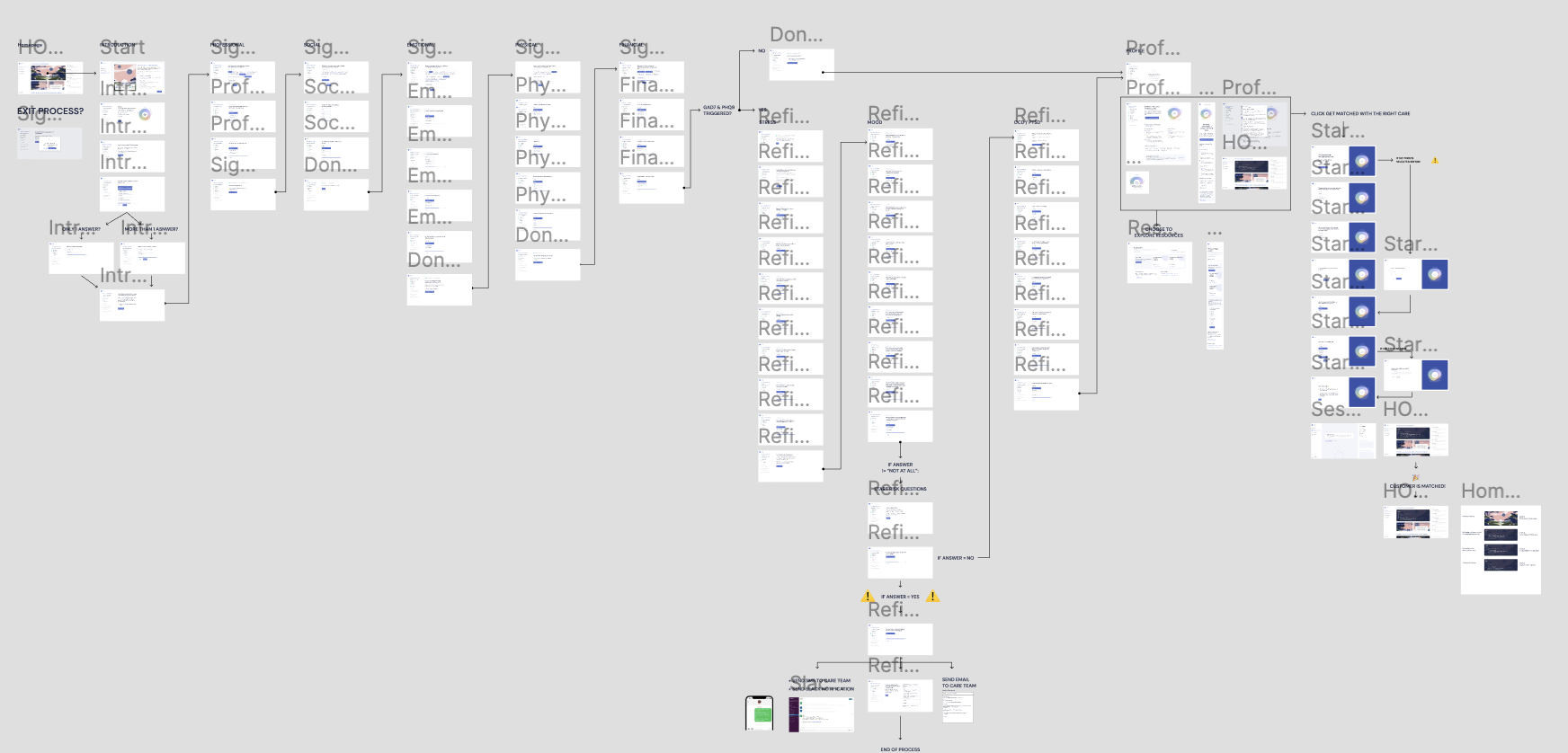


Part of the whole questionnaire structure. There was several redirections based on the answers provided by the user.
Example of official questions we had to ask the user in some of the high risk case scenario.
Components designed for large list of options. We also were showing constant progress to maintain motivation to move forward.
Example of step that was inserted to keep the motivation to continue the questionnaire and avoid drop off.
The final wellbeing shape, seen as non-judgmental by the users. It’s not a rating, it’s a state, fluid, in movement.
Copy plays a huge part in that feeling too.
Some of the content that was proposed to the user to help them in the areas they wanted.
Mobile version of the questionnaire.
Some of the components specs to hand off to the devs.
The wellbeing shape was difficult to draw in JS, so I studied the SVG drawing and convert coordinates in Figma to the points and beziers of the SVG.
First version of the wellbeing score. Huge fail amongst users during user testing. It’s obvious now anyone would feel judge by this, and still, all competitors use a similar kind.
More case studies

Ending the “no show“ of free online workshops
Everyone has done it: Signing up for a free online workshop and not showing up. See how we did to incentive users to signup and participate.

Repeating the same actions 700x for 8 hours, standing up.
That’s why we had to optimise the parcel return flow for employees in the warehouses. Working conditions are very hard, see how we manage to ease their day a little.